 Pricing
Support
Log in
Sign up
Pricing
Support
Log in
Sign up
by Almar Klein | published 01-02-2022 | last edited 01-02-2022
How to process time tracking data in Excel
Tracking your time provides insight into how you spent it, and can help you become more effective and reach your goals faster. Spreadsheet software can help you do this, e.g. Microsoft Excel, Libre Office Calc, Google Sheets, and MacOS Numbers. You can keep track of your time directly in the spreadsheet, or you can use a time tracker that can export to CSV.
TimeTagger is a simple time tracker that you can use to track time using #tags, allowing for flexible ways to analyse your spent time. It provides interactive visualisations to help you get insight quickly, but can also export to a spreadsheet, so you can process the data any way you want.
In this article I'll explain the format of the spreadsheets that TimeTagger produces, and show a few analysis examples.
Exporting your data
In the report dialog, you can see a detailed overview of the tracked time. There are a couple of options:
- The reported period is based on the currently selected time-range in the app.
- If you have any tags selected, the records are filtered accordingly.
- The records can be grouped in various ways. More on that later.
- It is recommended to check the Hours in decimals option, because that makes the numbers much easier to process.
- You can chose to include the full table or only a summary of totals per group.
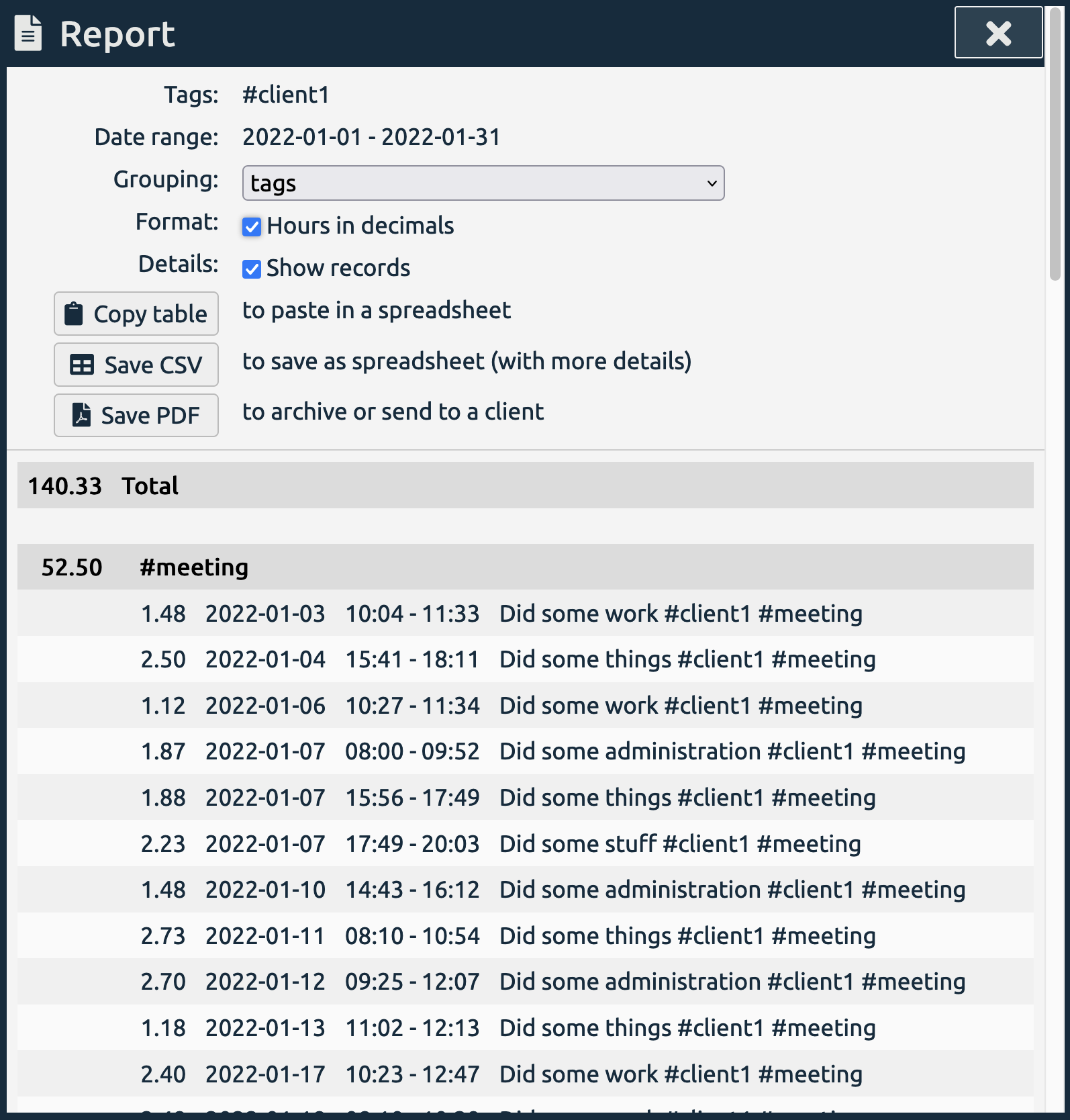
Once you've tweaked the table to your liking, you can export it:
- By clicking Copy table, the table is copied to the clipboard, and you can paste it in a spreadsheet.
- Alternatively, you can save the table as CSV and then import it as a spreadsheet. This will include a few more columns than just copying the table. More on this later.
- You can also export to PDF, but that's not interesting if you want to analyse the data.
What's a CSV file?
Let's briefly discuss what a CSV file is. If you already know this, you can skip this section.
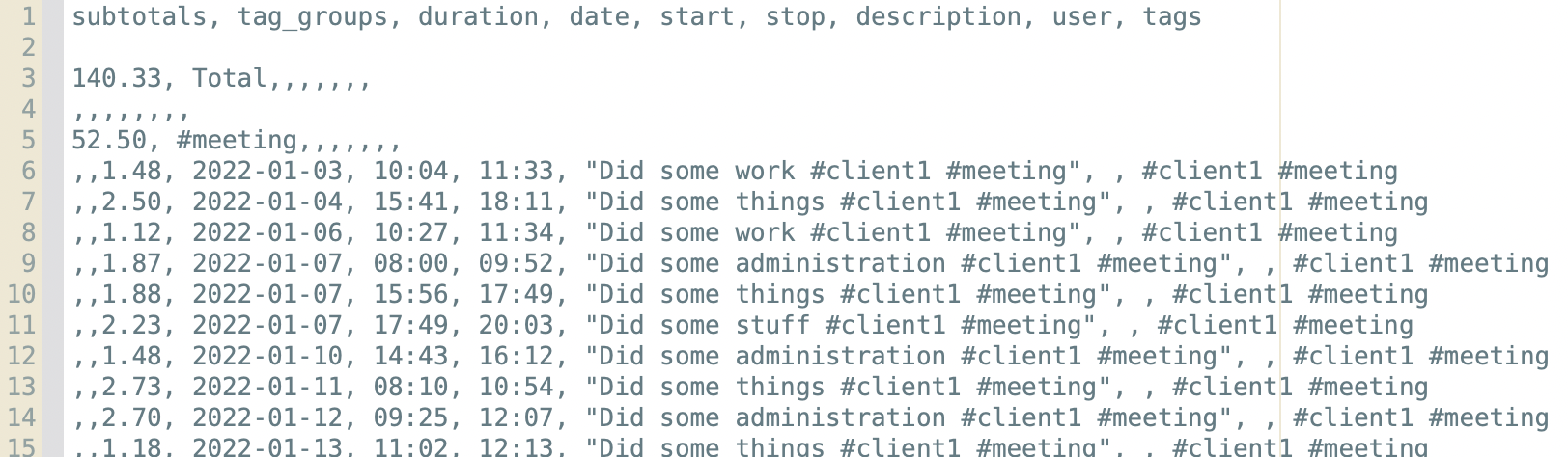
CSV stands for Comma Separated Values. It's a text file in which values are laid out in rows, where the columns are separated by - you guessed it - commas. (Technically other separators may also be used, but commas are most common.) The first row usually represents the header. It is a very simple format that can be consumed by many different software applications.
The table in the image above looks like this in CSV:
The columns
When you open the data in a spreadsheet program like Excel, you'll get something like the image below. The blue box indicates what you get via Copy table (it matches the table in the report dialog). The extras of using CSV include headers, and two extra columns: the user email and the tags.
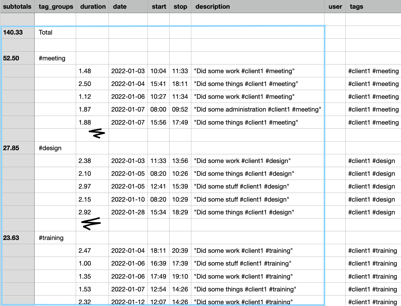
The header indicates the meaning of each column. The most interesting columns are probably the first (the total hours for each group) and the third (the time for each record). You may use any of the other columns to e.g. filter the data, as we'll do in the examples.
Grouping
The data can be exported with different groupings. These include grouping by tag, by date, and no grouping. The grouping may get you close to the information you are interested in, but sometimes you may also want to analyse the data further. We look at that in the next section.
Examples
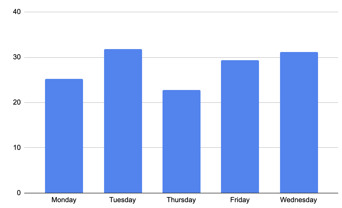
Distribution per weekday
Let's add a column "weekday" using the following formula: =TEXT(WEEKDAY(D6), "dddd") This will show the name of the weekday (e.g. Monday) for each record. This formula applies to Google Sheets and may differ in other applications (e.g. it's =DAYNAME(D6) for MacOS Numbers).
Then we combine column C (the record-duration) and the newly added column into a bar chart, and we get an impression on what days we work the most.
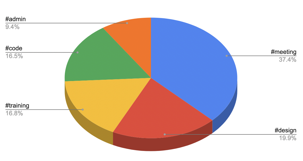
Summarise based on a tag
The following formula sums together the duration of all records corresponding to a certain tag: =SUMIF(I:I, "*#meeting*", C:C). It's best to use column I (tags) for this, because the tags are made lowercase (this might not be the case in column G (descriptions) ). This formula can be the basis of many processing flows.
For this example, we create a small table with two columns: one for tags and one for the summaries using the above formula. We can then get a tag distribution like the image below.
Endless possibilities
With some Excel skills, or Excel-Googling skills :), you can come a long way to process your data and get more insight!